CSS Animations
🎯 Learning Goals
- Write transformations for HTML elements
- Build CSS animations with keyframes
📗 Technical Vocabulary
- Animation
- Keyframes
- Transformation
Overview
CSS has some “behavior tricks” up its sleeve. Through CSS transitions, transformations, and animations you can create quite a bit of movement on your page without any real JavaScript. Check out some of these stunning examples:
Transformations
transform is a CSS property that can be used to change the way an element is presented. It can take a variety of values. Here are some popular ones:
transform: translate(40px, 100px);transform: scale(4);transform: rotate(180deg);
Each of the examples above provides specific values (40px, 100px, 4, and 180deg), but those numbers could change.
Try It: Transformations
Open up the CodePen below, fork it, and play around with these examples. We already have transform: rotate(90deg); in there right now; what is that property doing?
See the Pen Try It: Transformations by Turing KWK (@turing-kwk) on CodePen.
Animations
animation is a CSS property that can be used to animate other CSS properties like color, background-color, height, width, and more! The value of the animation consists of 3 things: the name, duration, and timing. More can be added, but those 3 are the main things you will use and see. Look at the example below and try to make sense of how the CSS is making the change of colors happen.
See the Pen Check It Out: Animations by Turing KWK (@turing-kwk) on CodePen.
Animation Values
Let’s break down what’s happening with that 3-part value for the animation property:
changeis the name of the keyframe, or set of directions, for the animation to follow. More on that in the next section5sis the duration that this animation will occur over. You can change it to1s(1 second) and see it speed up, or to something like15s(15 seconds) and see it really slow down!infiniterefers to how long we want this animation to continue. Specificallyinfinitewill continue, almost on a loop. You can substituteeaseorlinearand see what changes. (There are more, less popular options here as well!)
Keyframes
@keyframes are really where the magic happens. In the previous section, we mentioned change as the keyframe. Without the @keyframe named change, the word change would just be some undefined variable that CSS would ignore.
@keyframes allow us to control the animation each step of the way by defining styles along the animation sequence. In the CodePen above, we had keyframes at 0%, 50%, and 100% - so at the start, half way through, and at the end of the animation duration (the number of seconds you provided), those CSS rules will be true. The code from the CodePen is annotated below:
@keyframes change {               /* the name of the keyframe is "change" */
  0% {                            /* at 0% of the time, so at the start... */
    background-color: #331C82;    /* make the background color #331C82 */
  }

  50% {                           /* at 50% of the time, so halfway through... */
    background-color: #1C8266;    /* make the background color #1C8266 */
  }

  100% {                          /* at 1000% of the time, so at the end... */
    background-color: #331C82;    /* make the background color #331C82 */
  }
}
In between the 0% and 50%, and 50% and 100% directions, CSS is smart enough to make that change between those two rules very gradually so it’s a smooth transition!
Try It: Animations
Either in the CodePen you forked from the first Try It or a new one, write an animation for something that's not changing the background-color! Also, try using percentages other than 0%/50%/100% - play around with different ones and see how it impacts the animation. Have some fun!
Building a CSS Ghost
For the rest of this lesson, we will work through building a little bouncing ghost with CSS animations! Eventually, he/she/they will look like this:

But we’ve got to start simple. First, let’s create a container div that we can use to contain all of our ghost parts (body, eyeballs, flaps, etc.). We’ll give this container a width of 100px in CSS.
<div class="ghost-container">

</div>
.ghost-container {
  width: 100px;
}
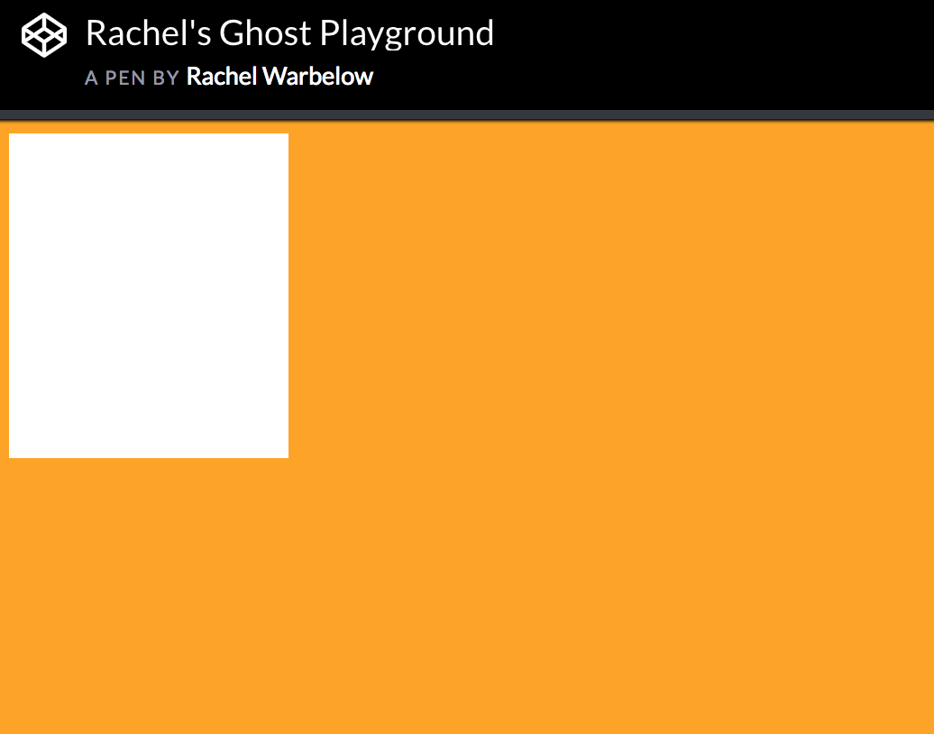
Now that we have a container, we can add another div inside for the basic ghost body. We will style the height and background color of this inner ghost-body element to look like the picture below:

Basic Ghost Shape
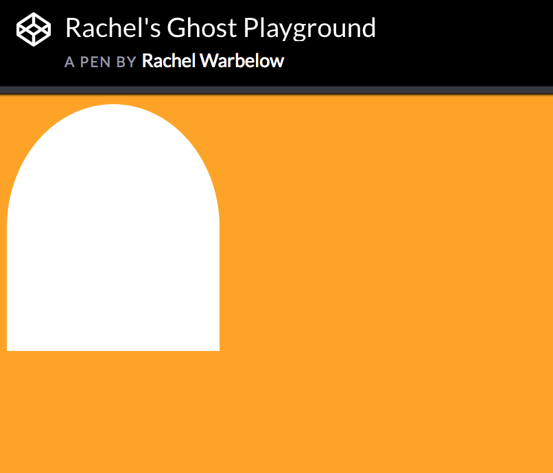
Let’s use a border-radius to create the head of the ghost.

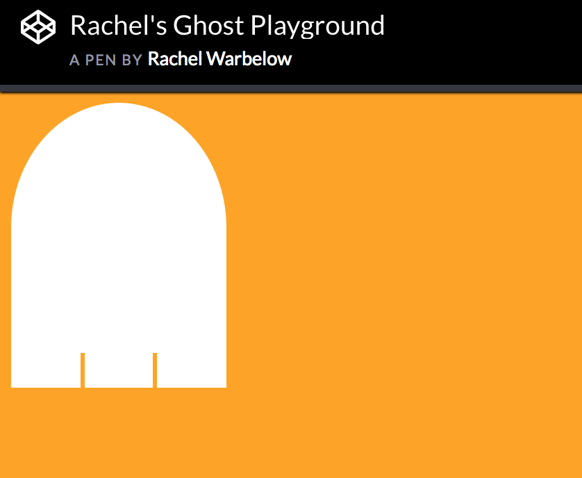
Ghost with Basic Flaps
Next, we’ll add three more divs to create flaps. Give these flaps the class of “flap”. We’ll use CSS to get these divs to line up next to each other. NOTE: This part may take some tinkering, like this.

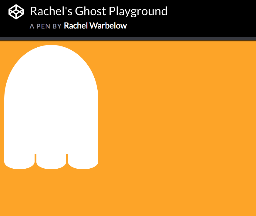
Ghost with Curved Flaps
Finally, we’ll use the border-radius to curve the flaps on the bottom.

Transformations
Add this line to your .ghost-container:
.ghost-container {
  transform: translate(200px, 50px);
}
Earlier, we talked about some of the transformations at our disposal. You can also add more than one transformation. For example:
.ghost-container {
  transform: scale(0.3) rotate(-40deg);
}
Try It: Ghost Transformations
Add one or more transformation values to your ghost-container and change the values to see how it changes your ghost.
Animation with Keyframes
Keyframes allow us to define a specific set of styles over the course of a time period. For example, if you said you wanted an animation to last 10 seconds, you could then define what you want the element to do at specific percents through the time period.
There are two parts to this process: First, you must define the keyframes. Mozilla Keyframes Docs
Then, you need to define the animation property for a specific element. Mozilla Animation Docs
This is what they look like when used in conjunction:
.ghost-body {
  animation: camouflage 5s linear infinite;
}

@keyframes camouflage {
  50% {
    background-color: orange;
  }
}
Using Keyframes to Add Horizontal Movement
Can you use what you know about keyframes and the animation property to make your ghost move across the page?
Hint: You’ll need to use the transform: translate() property. Be sure to add two values for pixels inside of the parentheses.

Multi-directional Moving Ghost
Now, let’s get more complicated. Right now, we have one keyframe at 50%. Can you make several keyframe points so that the ghost looks like it is floating across the screen while also moving slightly up and down?

Ghost with Wiggling Flaps
Define another keyframe called wiggle and make it so that the border-radius on the ghost flaps change in some way at 25% and 75%. Be sure to add animation: wiggle 3s linear infinite to your .flap rule in CSS.

Ghost with Eyes
Add two divs within the ghost-body div and give them a class of .eyeball. Then style the eyeballs to have a height, width, border-radius, margin, and display inline-block. Then add text-align: center to your .ghost-body styles in order to center the eyeballs.

Blinking Ghost
Create another keyframe, blink, that changes the height of the eyeballs.

Ghost Shadow
Add a div below the ghost-body div and give it height, width, background-color, and a border-radius. It should automatically float if it’s inside of the ghost-container div.
